The internet devours images. The World Wide Web is a furnace whose users and contributors shovel into its belly content like coal by the scoop shovel full to keep us all mesmerized by it’s flames and lulled by its heat. This notion was in my mind last month when I was asked to strike a mark for a new enterprise in Denver Colorado by my pal Curt. Curt co-owns the venerated Hi-Dive, a landmark of independent music and community right smack on the South Broadway strip full of enlightened, cultured, and 4G connected internet users. I thought I had found the project to try something new.
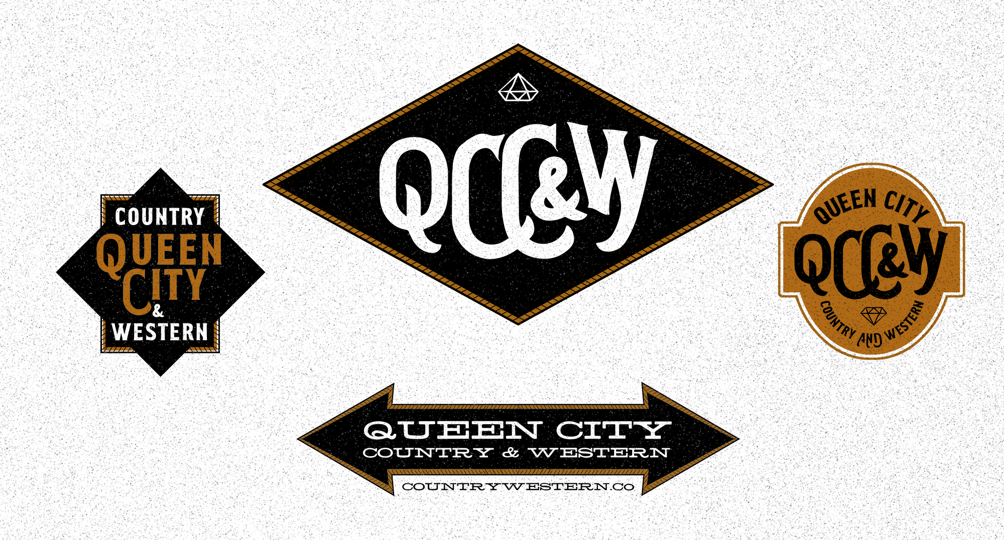
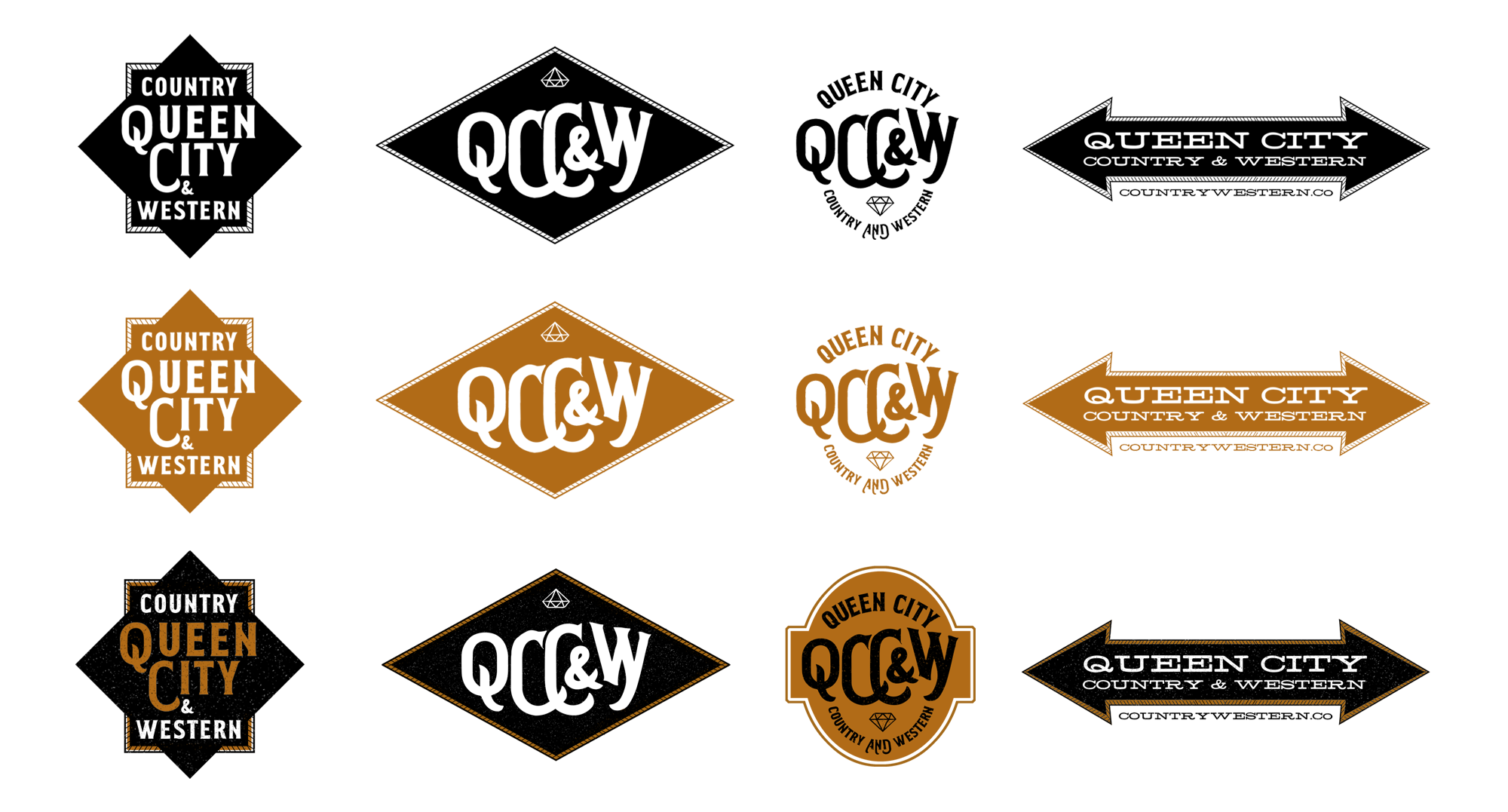
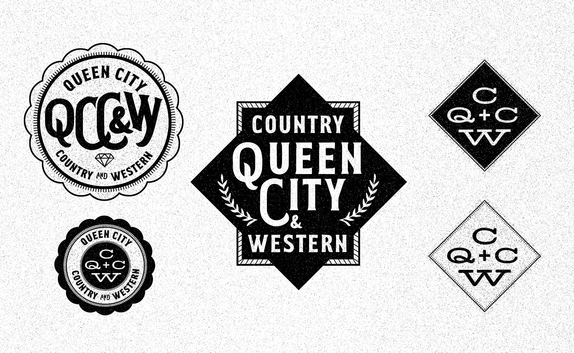
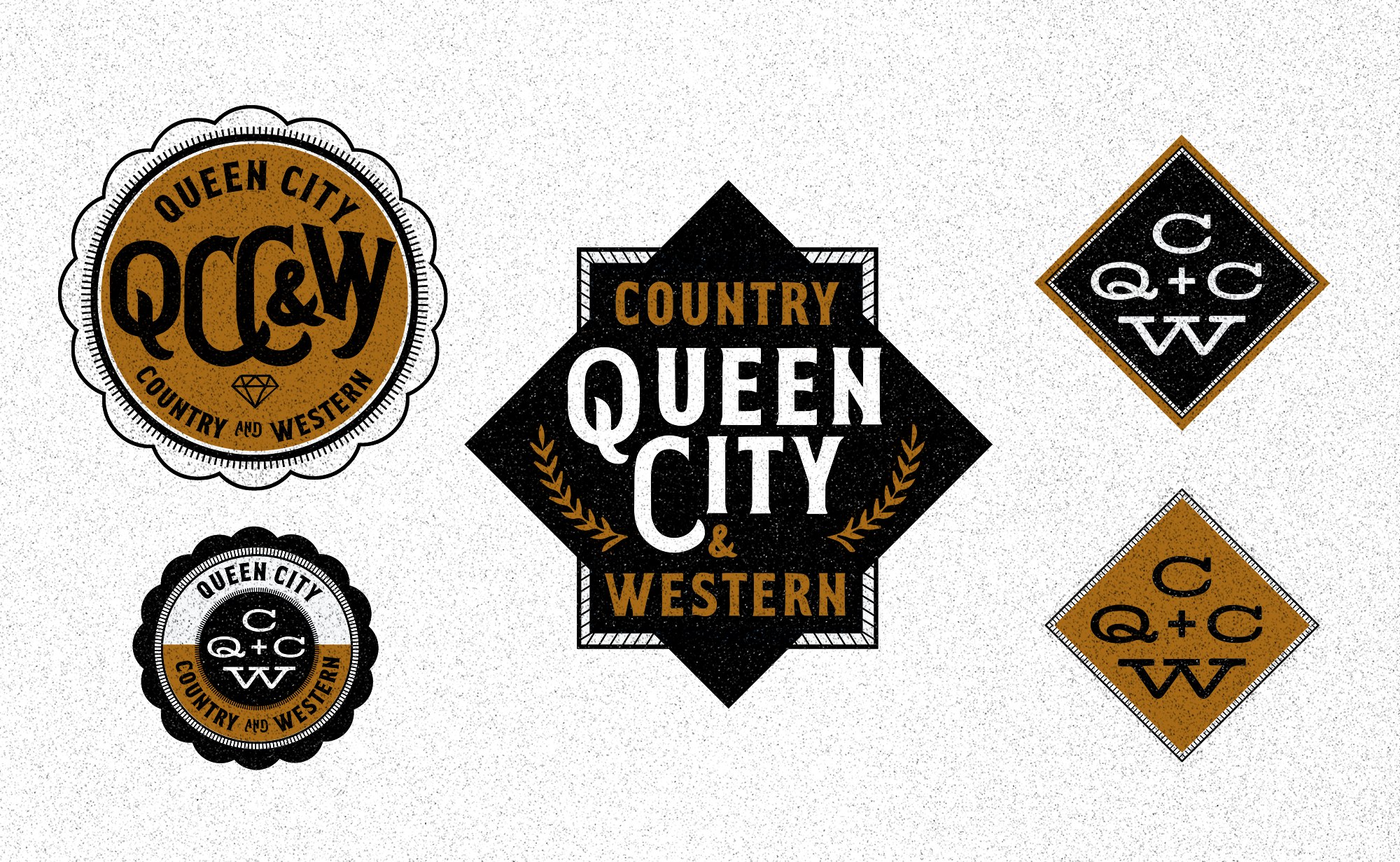
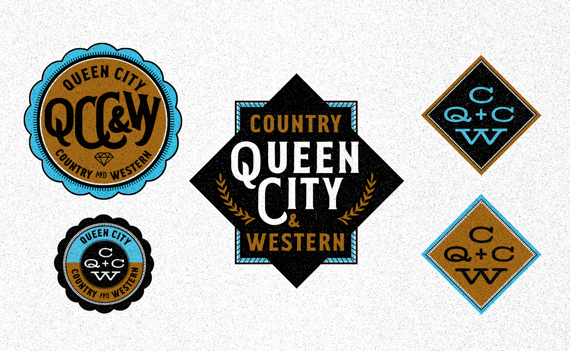
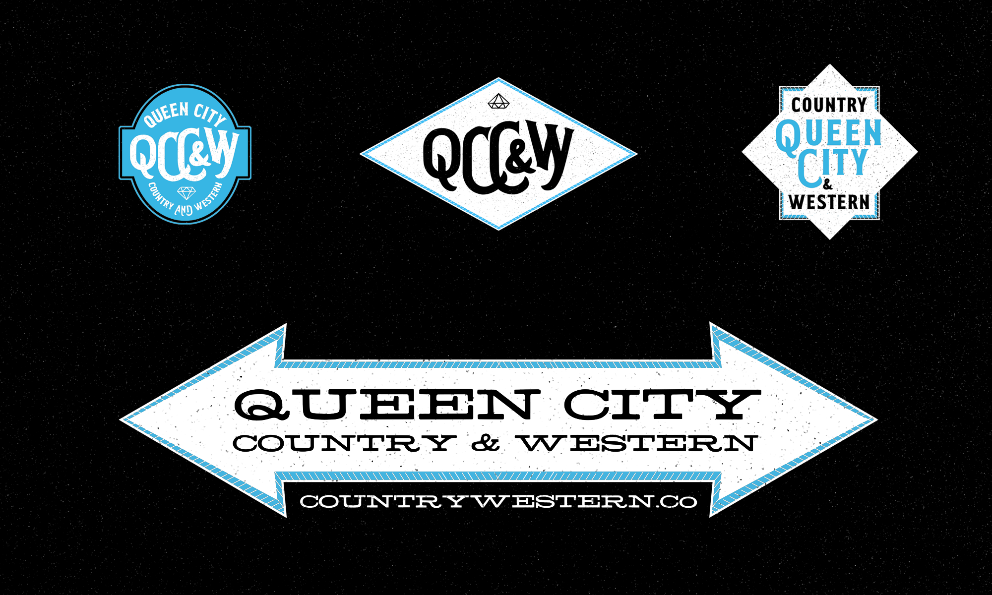
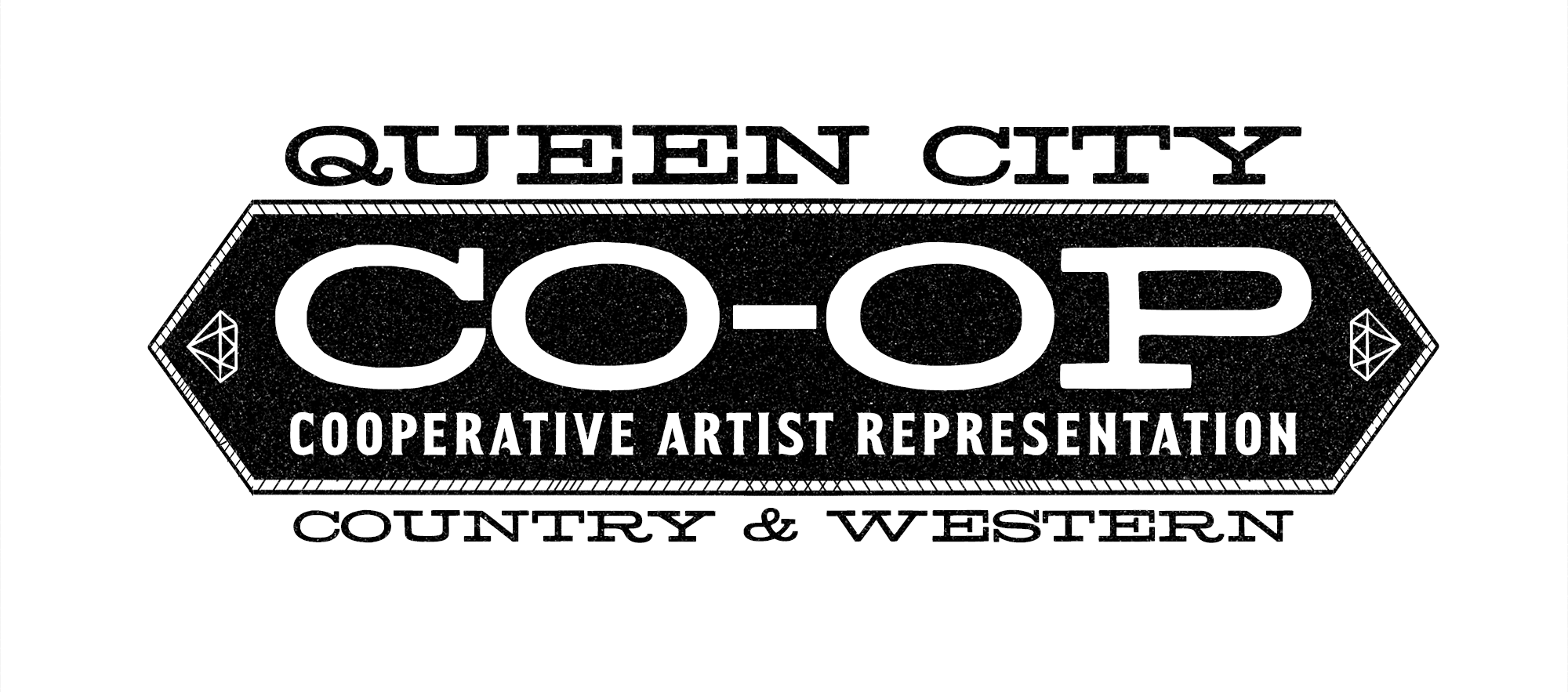
This project was commissioned for a Country & Western artist representation cooperative. It wasn’t only Curt, but a collection of musicians and bands who would be using this new logo. Instead of stressing singular consistency of visual standards, I turned the traditional standards upside down. I didn’t approach this work as creating a single logo. I treated it like creating content. And intend those who use it to do the same.
For inspiration, I researched what Denver used to be. In perjorative terms, is was a cowtown. The agrarian economy that built Denver is presently being rebuilt over and left behind. Denver is well within the Top 10 fastest growing cities in America by several counts. But before that, grain mills, feed and seed stores, railroads, ranchers, cattle brands, farm Co-Ops, blue ribbon county fair livestock winners, women and men with tough hands, and sunburned necks wearing Ag Hats built the foundation for today’s construction cranes and luxury loft living.
I have a growing notion that design doesn’t matter like it used to. Not in the “kids these days” sort of lament, but rather in “the internet has changed human behavior and let’s just call a spade a spade” way. Design matters, in a different way. The reverence for a singular and fixed logo has given way to countless and continuous variations, knock-offs, derivatives and parodies. Intellectual property writ large has faded to a thousand shades of gray – the gradations color music, video, image, and certainly word.
So for this project I took a new approach. I called a spade a spade. I didn’t bother to stress, revise, review, deliberate, discuss and try to perfect a single mark. As soon as began sending Curt early versions, he’d put them on Instagram. He built a website. He put the design to immediate use. The best tool is the one in your hands sort of thinking. He’d modify and add and alter the developing logo mark. He’d do what everybody does. He took design and made it content. He put the plow in the dirt and started pushing – and posting. Feeling validated in some ways by this, I didn’t spend my time finalizing anything. I just gave him a variety of options and full license to run in any and all directions: open source imagery and brand marks to use, abuse, reuse, and run full speed ahead in any and all directions he needs to. Luckily he is a client who knows what he is doing, and has the a great sense of it all. (Everybody has the tools.)
If design is in service to humans, then design, first and foremost, gets the job done; the job that was harder, more complicated, slower and less meaningful before. Perhaps this project will be the latest bend in the gravel road I call my design journey. Make stuff that works. Use it. Break it. Fix it. Keep moving. Keep making. Keep feeding the fire.
